
Lead follow-up · 2026-09-19 · 8 min read · By Arden Talbot, founder of SheetLink
Form abandonment: what you can measure
The people who started your form and left are invisible in every report you have. Some of them can be counted, and a few of them can be recovered.
The population you never see
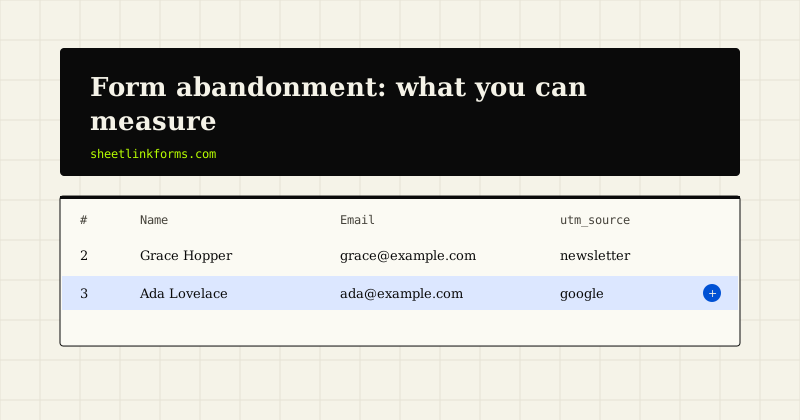
Your submissions sheet contains the people who finished. Every report you build sits on that data, which means every conclusion you draw is about the survivors.
The people who opened the form, started typing and left are absent from all of it. They do not appear as a low conversion rate, because you are probably not measuring the denominator either.
For most sites this group is larger than the group that completed. That makes it the biggest single opportunity on the page, and the one nobody looks at.
It is worth being precise about what can honestly be known here, because the subject attracts a lot of tracking that produces numbers without producing insight.
Three things worth counting
The first is the ratio of form views to submissions. This needs no field-level tracking at all: how many people saw the page with the form, and how many enquiries arrived. Page analytics gives you the first, your submissions sheet gives you the second.
The second is that ratio broken down by device. Mobile against desktop is where the largest and most actionable differences usually appear, and it needs only that your analytics splits sessions by device.
The third is the same ratio by page, if the form appears in several places. A form that converts well on one page and poorly on another is telling you something about the surrounding copy rather than about the form.
Those three numbers, calculated once a month, tell you more than any heatmap.
What field-level tracking adds, and costs
It is possible to record which field somebody reached before leaving. Done well it identifies exactly where the form loses people.
The cost is that you are now recording behaviour rather than a submission, which carries a privacy weight the rest of your form does not. If you capture what somebody typed into a field before abandoning, you have collected personal data from a person who chose not to give it to you.
That is a genuinely uncomfortable position, and it is the sort of thing that ought to appear in your privacy notice if you do it.
The defensible version records the position reached, not the contents. Knowing that people stop at field six is enough to act on and does not involve capturing anything they wrote.
The usual suspects
Abandonment concentrates in predictable places, and it is worth checking these before instrumenting anything.
The phone number field, when required. The budget question. Any field whose purpose is not obvious. The point where the form visibly lengthens. And the submit button, when nothing appears to happen after it is pressed.
That last one is not abandonment in the usual sense, it is a failure being read as one, and it is the most recoverable of the lot.
A form that does not visibly acknowledge a click loses people who did everything right, which is the most expensive way to lose somebody.
The mobile gap
If you measure only one split, measure this one. The difference is usually large and the causes are usually fixable.
Typing is slower, screens are smaller, autofill matters more, and any field that requires precise input is disproportionately harder. A form that is mildly tedious on a desktop can be genuinely unpleasant on a phone.
Practical checks: does the keyboard that appears match the field, does the layout avoid horizontal scrolling, are tap targets large enough, does autofill work for the standard fields.
That last point is worth its own attention. Correctly marked fields let a phone fill in name, email and phone in one tap, which removes most of the typing burden. Getting the markup right is one of the highest-value mobile changes available.
Recovering the ones you can
Partial recovery is possible when the form is long enough to justify it, and the mechanism is ordering rather than technology.
If the contact method is collected first, and the form persists what has been entered as it goes, then a person who abandons at step four has still given you something you can act on. Whether you should act on it is a judgement call: a person who abandoned deliberately did not consent to being contacted.
The safer version is to use the information in aggregate rather than individually. Knowing that a third of abandonment happens after step two justifies restructuring the form, without contacting anybody who chose not to submit.
For a short contact form none of this applies, and it should not be built.
The change that usually wins
Across most sites, the intervention with the largest effect is not a tracking system. It is removing fields.
That is unglamorous and it is consistently what the data supports. Each field removed reduces the apparent effort, and the apparent effort is what people judge before deciding, as covered in the cost of every extra required field.
Second place usually goes to fixing the submit feedback, because it recovers people who had already decided to convert.
Field-level analytics comes some way behind both, which is the opposite of the order in which most teams tackle them.
What not to do
Exit intent popups asking why you are leaving. They irritate, they are ignored, and on mobile they are frequently broken.
Session recording of form interactions, which captures keystrokes and turns a form into a surveillance surface. The insight rarely justifies it, and it creates a data holding you would struggle to describe honestly.
And treating an abandoned form as a lead to be pursued. Somebody who started and stopped made a decision, and contacting them on the strength of a partially completed form is a fast route to a complaint.
The honourable version of this work is to make the form easier, not to chase the people it defeated.
A monthly routine
- Count form page views and submissions, and calculate the ratio.
- Split it by device, and by page if the form appears in several places.
- Compare against last month rather than against an industry benchmark.
- If it moved, ask what changed on the page or in the traffic.
- Fix the largest gap, then measure again next month.
Comparing against your own history is the important part. Benchmarks for form conversion are close to meaningless, because they aggregate incomparable forms, audiences and offers.
When the number moves for the wrong reason
A rising ratio is not automatically good news. It can also mean your traffic became narrower, or that a spam run inflated the submission count.
This is where screening matters for measurement as much as for tidiness. If automated submissions are counted alongside real ones, your conversion rate improves every time you are targeted, which is an unhelpful incentive.
Count screened submissions rather than raw ones, and the number means what you think it means.
The same caution applies to any month where you changed the traffic mix. A ratio that improved because you stopped buying a cheap source is not the same finding as one that improved because you shortened the form, and only one of them is a lesson you can apply again.
The summary
Measure the ratio of views to submissions, split by device, monthly, against your own history. Fix the obvious things first, which are usually field count and submit feedback. Instrument the form only if those have been done and the gap persists.
And keep the ambition modest. The goal is a form that fewer people give up on, not a complete accounting of everyone who ever hesitated. The second is not achievable at any reasonable cost, and pursuing it tends to produce surveillance rather than improvement.
FAQ
What is a good form conversion rate?
There is no useful benchmark, because published figures aggregate incomparable forms, offers and audiences. Compare against your own previous months, which is the only comparison where the other variables are approximately constant.
Can I measure abandonment without tracking fields?
Yes, and it is the version most sites should use. Page views against submissions, split by device and page, identifies where the losses are without recording anyone's behaviour inside the form.
Is it acceptable to capture partially completed forms?
Recording the position someone reached is defensible. Storing what they typed before abandoning means collecting personal data from a person who chose not to give it, which needs disclosure and is hard to justify for an ordinary contact form.
Should I contact people who abandoned?
Generally no. They made a decision by not submitting, and contacting them on the strength of a partial form is a reliable route to a complaint. Use the pattern to improve the form instead.
Why is mobile abandonment so much higher?
Typing is slower, screens are smaller and precise input is harder. Check that the correct keyboard appears for each field and that autofill works, since correctly marked fields can fill name, email and phone in a single tap.
Do exit intent popups help?
Rarely. They irritate, are widely ignored, and behave poorly on mobile. The effort is better spent removing a field, which addresses the reason people were leaving in the first place.
What single change recovers the most enquiries?
Removing fields, followed by making the submit button visibly acknowledge the click. The second recovers people who had already decided to convert and thought the form was broken, which is the most painful category of loss.
Should spam submissions count in the ratio?
No. Counting them means your conversion rate improves whenever you are targeted by automation. Use screened submissions so the number reflects real enquiries.
Count what arrives, fix what does not
Every accepted submission is recorded with its page and campaign, so the gap between visits and enquiries is measurable rather than theoretical.
Start freeSee the live demoQualifying questions that do not kill conversionThe follow-up log: a spreadsheet pattern